Branding, signs, stationary & web design for Iori Hotel, Resto & Shop {Japanese hotel & restaurant located at Vielha, Spain}
Spain {2007-2008}
Iori is a Japanese style hotel, restaurant & shop at Pirineos Catalanes in Vielha city.
For this particular project Tea Time had developed the global identity; including the logo, icons, stationery, pins, packaging, signs, gadgets, website, and more...
CASE STUDY:
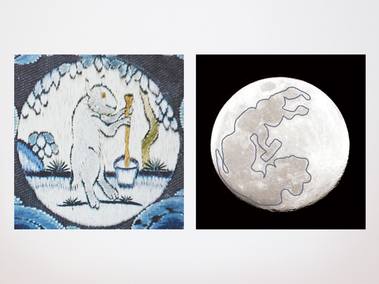
The bunny image was inspired by a traditional Japanese image of “the rabbit in the moon” that is celebrated every year in order to bring prosperity to everyone.
This is what the legend says: In Japanese culture, the rabbit is closely associated with the moon. Where westerners often see a "man in the moon", the Japanese see a rabbit in the moon's design.
The Moon rabbit, also called the Jade Rabbit, in folklore is a rabbit that lives on the moon, based on pareidolia that identifies the markings of the moon as a rabbit. The story exists in many cultures, particularly in East Asian folklore, where it is seen pounding in a mortar and pestle. In Chinese folklore, it is often portrayed as a companion of the moon goddess Change, constantly pounding the elixir of life for her; but in Japanese and Korean versions it is just pounding the ingredients for rice cake.
The idea of using a traditional Japanese image also reinforces the particular concept of this Hotel (located in Spain!) and somehow the bunny itself makes you feel closer to the thoughts of winter and warmth. It is also delicate, like a warm warren too.
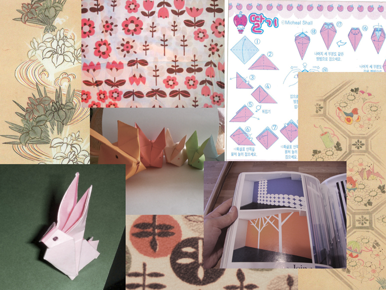
Here is a mood board with images of old Japanese textiles, colour palettes, origami, etc.
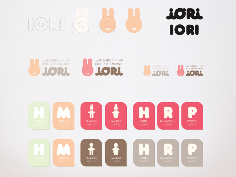
Before we see the definitive logo and branding here are 2 different options of branding that were not selected, but, I found them interesting to show you how the same brief and concept can be resolved with different aesthetic solutions.
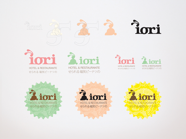
The final branding for Iori Hotel:
Here is the logo, the form of the bunny chosen and the icons, all of them were created using the logo type face forms.

Signs for the Hotel

Some stationary. The idea of using old family photos was a great solution to make the branding feel friendlier, like a family house. Essentially that is the idea of the Hotel, to make you feel so comfortable that you feel you’re in a family house in Iori Hotel. Also, the photos provided by the owner were AMAZING!


More offset cards.

Here is the Bar menu, using a vectorial traditional Japanese pattern.

For the postcards we wanted something more playful and that makes you want to collect and to keep with you, also because it has a map to get to the hotel on the back side! So we make some origami for it.


We also printed many useful note books for the guests to keep and to remember Iori.


Of course we made the Do Not Disturb hangers. Another collectable object for the guests.

Sushi kit and pins, I don't have the physical ones with me but this is the design for them, the pins were given away and later sold in the store.

Patterns to be used in future designs, all of them based on the logo and bunny illustration.

Some products to be sold in the store. The origami T-shirts were made by hand by the owner's grandma! So lovely.

Web design for Iori Hotel, Resto & Shop {Japanese hotel & restaurant located at Vielha, Spain}
*All programming and html, and php and stuff by the very talented team aerlab.
Visit Iori website here: www.iorihotel.com

